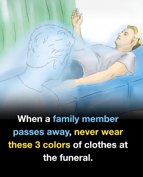
When attending a funeral, even the smallest choices—like the colors you wear—carry meaning. Clothing is more than just fabric; it conveys respect, empathy, and solidarity with those who are grieving. Many people don’t realize that certain colors, while perfectly fine in everyday life, can feel out of place or even disrespectful in a solemn setting. Being mindful of color choices helps ensure your presence reflects the right intentions.
Colors hold symbolic power. Some shades evoke joy, passion, or celebration, while others suggest humility and calm. At a funeral, the focus should remain on honoring the deceased and supporting the family, so wearing the wrong color can unintentionally disrupt that atmosphere. Bright red, for example, is best avoided. While it often represents love or luck in everyday contexts, at a funeral it can feel jarring and inappropriate—unless the family requests it for cultural reasons.
Neon or bold shades such as hot pink, lime green, orange, or bright yellow can also be distracting, as they are associated with fun and playfulness rather than mourning. Shiny fabrics, metallics, or sequins in gold or silver may send a similar message, drawing attention away from the service and onto your outfit. Even small accents in these colors can have this effect.
When unsure, simplicity is always the safest choice. Dark, muted colors like black, navy, charcoal, or deep brown are classic and respectful, while softer shades like beige or muted gray can work if darker clothing isn’t available. The goal is modesty and subtlety—selecting attire that allows the focus to remain on honoring the departed and supporting those left behind. By avoiding flashy or overly bright colors, you ensure your presence communicates quiet respect and compassion during a sensitive moment.