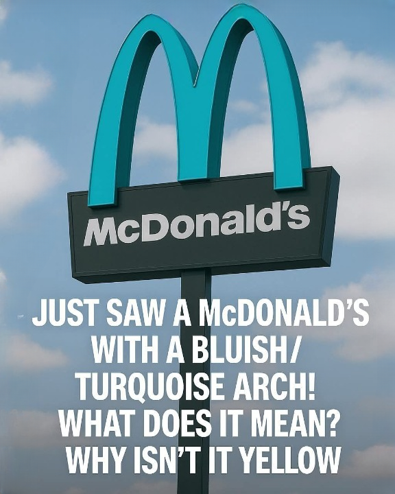
The Turquoise Arches: Sedona’s One-of-a-Kind McDonald’s
If you ever drive through Sedona, Arizona—a small desert town framed by breathtaking red rock formations—you might do a double take when spotting the McDonald’s. Something seems familiar, yet slightly different. The golden arches are nowhere to be seen. Instead, they shine in turquoise.
It’s the only McDonald’s in the world with arches of this color. And no, it’s not just a marketing gimmick. It reflects a community’s dedication to preserving its identity and honoring the natural landscape.
A Town Unlike Any Other
Sedona isn’t an ordinary town. Nestled between crimson cliffs and soaring sandstone formations, it draws visitors with its natural beauty, spiritual energy, and the way human development harmonizes with the land. Long before it became a tourist destination, Sedona was known for its deep respect for nature. Strict building codes ensure that no structure overshadows the stunning landscape.
So when McDonald’s planned to open a location in 1993, they faced something unusual: a community unwilling to let a global brand compromise its visual integrity.
The Color Conflict
The dispute began with color. The iconic “Golden Arches” are instantly recognizable—bright, bold, and impossible to ignore. But city planners saw a problem. That vivid yellow would clash with Sedona’s red rock cliffs and soft desert tones, which make the town one of the most photographed places in the American Southwest.
Sedona’s architectural guidelines required commercial buildings to blend seamlessly with their surroundings using natural, muted colors. A glowing yellow “M” simply wouldn’t do.
At first, McDonald’s executives resisted. The arches weren’t just decoration—they were the brand itself. Changing them seemed unthinkable. Yet Sedona’s officials held their ground: if McDonald’s wanted to operate in the city, it had to adapt.
A Creative Solution
After weeks of negotiation, a compromise emerged. What if the arches weren’t gold, but turquoise? Drawing inspiration from a gemstone cherished in Native American culture, turquoise could harmonize with the landscape while keeping the McDonald’s identity recognizable.
Turquoise also carries meaning—it symbolizes protection, healing, and connection with nature. In the arid Southwest, it evokes the sky reflected on desert stone—a perfect fit for Sedona’s spiritual and aesthetic atmosphere.
McDonald’s agreed. When the restaurant opened later that year, locals were pleasantly surprised. The turquoise arches didn’t feel out of place; they seemed to belong.
A Symbol Reimagined
The change became more than a design choice—it turned into a symbol of how global companies can adapt to local culture rather than override it.
For Sedona, it was a victory for identity. For McDonald’s, it was a lesson in flexibility and harmony. The turquoise arches, contrasting gently with the terracotta cliffs, became a must-see landmark for tourists.
Today, visitors often stop just to photograph the sign—sometimes without even entering the restaurant. The building itself is unlike a standard McDonald’s: earth-toned stucco walls, low-profile architecture, and desert landscaping that complements the surroundings rather than competing with them.
Inside, it’s like any McDonald’s, but outside, it’s entirely unique: a global brand shaped by local values.
More Than a Color
The turquoise arches also tell a larger story about Sedona’s dedication to preservation. The city’s guidelines extend far beyond McDonald’s—from fast-food chains to gas stations to hotels, all buildings must respect the natural landscape. Signs are low, lighting is subtle, and colors harmonize with the environment.
The philosophy is simple: in Sedona, nature comes first, and development follows. It’s part of what makes the town so striking. Even with booming tourism, Sedona has retained its calm and authenticity.
The turquoise McDonald’s fits perfectly into that vision. It reminds us that even the most recognizable global brands can adjust when a community insists on preserving its character.
A Landmark of Its Own
Over time, the turquoise arches have become iconic. They appear in travel blogs, postcards, and art prints. Road-tripping couples stop for photos, and travel guides list the site as a quirky must-see. For many, it symbolizes Sedona’s uniqueness—proof that even multinational corporations can be shaped by local spirit.
Locals say the restaurant’s design adds charm. “It’s funny,” one long-time resident remarked. “You see it, and you know it’s McDonald’s. But it feels like Sedona’s McDonald’s—not just another cookie-cutter version.”
This sense of ownership reflects a larger truth: a community’s right to define its own aesthetic. In a world dominated by uniformity, Sedona quietly shows that individuality doesn’t have to be sacrificed for progress.
Lessons in Turquoise
The story of the turquoise arches may seem like a small detail—a design tweak at one fast-food restaurant. But it carries a broader lesson. It’s about compromise, respect, and how a global brand can listen to local needs rather than imposing itself.
Sedona’s approach challenges the idea that growth and environmental preservation cannot coexist. Protecting beauty and character doesn’t mean resisting change—it means shaping it thoughtfully.
As other towns struggle with overdevelopment and visual pollution, Sedona’s turquoise arches stand as a subtle but powerful example of balance. They remind us that a city’s soul deserves protection, and even an ordinary fast-food restaurant can honor the extraordinary land it occupies.
The Legacy of the Color
More than thirty years later, the turquoise McDonald’s remains one of Sedona’s most photographed landmarks. Tourists still marvel at the soft teal glow of the arches against the fiery cliffs. McDonald’s executives acknowledge the restaurant’s fame, citing it as an example of “branding with local sensitivity.”
It is also a quiet symbol of Sedona itself—resilient, creative, and committed to harmony.
So, next time you drive through Sedona and spot the turquoise arches glinting under the desert sun, remember you’re seeing more than just a fast-food restaurant. You’re witnessing a rare collaboration between commerce and conscience—between a company that adapted and a town that held firm.
And perhaps that shade of blue-green isn’t just paint. It’s a reminder that beauty is not imposed on nature—it’s created with it.